
My Old Sites
Web design is hard.
I started playing around with HTML/CSS early on, with a book I picked up from a local bookstore in middle school (Learn HTML & CSS - a book that teaches you in a nicer way (htmlandcssbook.com)). It's nice, it shows you the basics, and it's presented in a really friendly way.
Nothing I ever made was hosted on anything, but I had a lot of fun making some very childish sites back in the day.
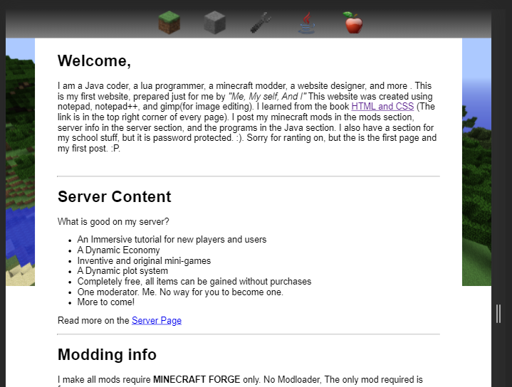
Delightfully juvinile. Nothing on the entire site actually worked, was all static HTML, and has pretty much no content. But it was a fun little thing. From there, I played around with a bunch of similarly styled pages, almost always styled after minecraft (my middle-school obsession). Of course, nothing was online, but I had fun making it.
Eventually, I needed an actual site.
With all the Pebble configuration pages, I hosted them through Github Pages. Each of the pages were nested under specific folders, but the index was a simple "Don't go to this site." Not useful or informative. But when I started sharing my projects online, and started to get a little interest in seeing my other work, I needed something. So, using Bootstrap for CSS and a background picture I had taken during a trip the previous spring, I made this:

It's still a static site, it's still hand-written HTML, CSS, and a little bit of JS, but it was much more professional.
Each section there opened when you clicked it, to reveal different categories of information. "He's Made" had a little carousel of projects (that you had to click through and view one by one), "He's Said" linked to my soundcloud account that had some narration of some short stories, "He's Learned" contained all the different skills and software I had learned, and "He wants to hear from you" contained contacts links.
It was a little smart, too. The "17" in orange there actually calculated my age when you loaded it. The picture there, too, was actually my avatar image from github, and would update automatically.
In addition, the website was "responsive." But only in as much as it fits on mobile devices - the extra spacing on the side just melts away.
Over time, I trimmed it down. Firstly, I added in a link to my resume - a critical part, considering this is a very informal site to begin with. I took out the "He's Said" and "He's Learned" sections, and forced the "He's made" and "He wants to hear from you"
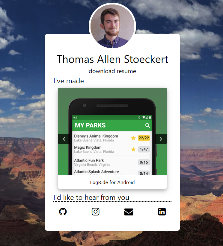
This site served me well for about four years. However, it really lacked in the documentation section. Each project was just a picture and a link to the project's main page, but little surrounding information. With this new site, that changes.